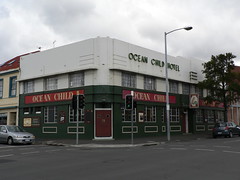
 Earlier this month, Thomas Ryan posted a glorious b+w photo of Hobart's Ocean Child Hotel on his Art Deco & Modernism Architecture Tasmania blog.
Unlike my photo (right), Thomas has concentrated on the signage remarking on how the lettering played a major part of Modernist design.
It also looks like the hotel has been repainted (assuming Thomas has posted a recent photo) allowing the three-dimensional nature of the signage to provide the contrast with the body of the building. Too often we see the signage and other decorative features highlighted in contrasting colours where originally the design was intended to be more subtle. The shadows cast by the changing angle of the sunlight striking the facade at different times of the day providing the visual highlghting of the decoration.
Go back and have a look at Thomas' photo again and I think you'll see what I mean.
Tidak ada komentar:
Posting Komentar